Written by Beth Zollars
10 Minute Read Time
For fifteen years we have called Pawnee Circle in Leawood Kansas (a suburb of Kansas City) home. People are curious how this New York girl ended up in the middle of the country.
“How did you end up in Kansas?” Answer goes something like “well.. give me about an hour and glass (or two) of wine”.
However we got here via, New York, Chicago, LA, Miami, etc..It continues to be a magical place for the Zollars clan.
Kansas City has deep roots in the arts and culture scene and now more than ever is experiencing a renaissance of arts, food, and urban development. I’m actually cautious about spreading the word, we don’t have a ton of big city problems, even with 2 million plus people.
Now empty nesters – We currently split our time between the Midwest, Laguna Beach and the Adirondacks – a rather unique situation to say the least.
Our KC home recently went on the market for the usual “sizing down” reasons. I have mixed feelings about leaving my home.
If I close my eyes I hear the roar of belly laughter emitting from a gaggle of little boys in my son’s bedroom or the chatter of 500 women gathered for cocktails and fundraising. Memories for a lifetime.
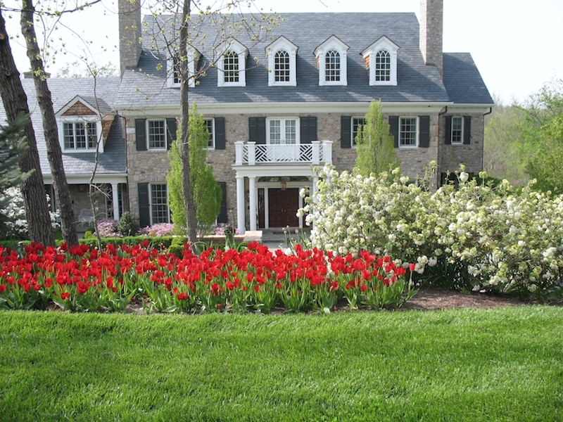
Our home, hosted, organized, strategized, celebrated and mourned too many memories to recollect in one sitting.
However, I am going down a rabbit hole I didn’t intend, so I will get back on track to the task at hand, and save the chat about family homes and memories for another post, when I have a box of Kleenex handy.
Back to my house and classic design.
It was a mammoth four year building project with a year of prep work just to stabilize the site. We had almost 200 steel piers installed securing the foundation – preventative hill sliding into the creek. The lot was 80 ft down from street height to our back fence line with a east/west slope of 40 ft just to make it interesting.
Needless to say, it was a challenging site so we choose the best of the best and came away with the “A” team. Howard Neering was our architect, Andy Fritzel our builder and Ann Egan and I tackled the interiors.
Side note: Throughout the post I use many photos, some good, much more so-so, and a couple wowza. Even after my decade at Kodak, I think I am a pretty decent photographer, but interiors are tricky. I still have some lights, and proper equipment, but most of these shots were shot with available light and an I-phone. So I’ll join the #crappyiphonepicsaremyjam. Be kind.
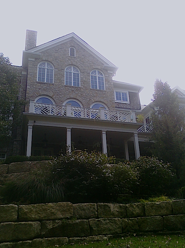

The scope of the project was rather large. 
Some of the revisions…
After much research on my end, including a library of Architectural Digest going back 20 years, we chose to build a Classic Stone Georgian reminiscent of something you would see in various enclaves of east coast origins.
My husband, not an old house person and moi, a very old house person, had to meet in the middle, as we often do in life, and settled on creating a new house with old materials.
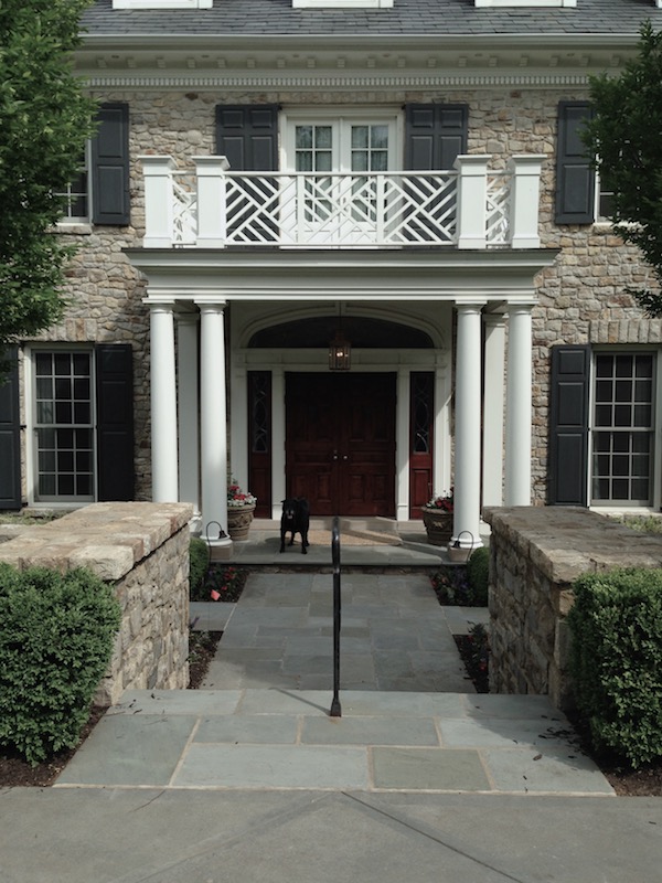
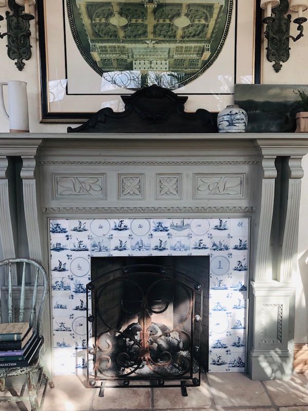
For many of the architectural elements we used vintage, reclaimed materials; Southern pine for the flooring and some of the millwork, vintage clay octagon tiles from Parisian streets, marble fireplace surrounds from Philadelphia, and old stone and slate from a church in Vermont. I wanted the house to even “smell” old, (in a good way).
Because of the slope of the two acre lot, the house ended up becoming four stories. We finished three of them ending up with just under 12,000 sq. ft. It is a lot of house for sure, but with our crazy big family I knew the space would be well used.

We have lived in our home almost fifteen years, and the style has a classic , comfortable feel. When we built it we were entertaining much more, and in a much more formal way.
Considering our life is much more casual these days, I may not have made the same formal choices – But then, our life had different needs, my husband’s position required me to entertain on a large scale, many occasions formal – and with my own retail business my home became a regular spot for small or large gatherings.
Choosing a classic architectural design and interiors definitely has staying power over year to year trends.
However, if we were staying, I would update some of the interiors to reflect a bit more modernism, and casual lifestyle, than period, formal traditional decor. The lighting, hardware, fabrics etc. could use a bit of an update – but I wouldn’t change most of the architectural elements of my home.
The moldings, fireplace surrounds, beams and other millwork play as well today as they did fifteen years ago.
The space is still fresh, inviting and unique. It says a lot about the enduring value of the architectural style elements.

So why create a home with classic style and what does it look like?
Timeless design – or anything timeless for that matter – has staying power. It was not created to be temporary. It was never anything considered to be a fad or a trend.
If you want your home to have that timeless look, one that is as fresh and relevant today as it was yesterday, and will be tomorrow, you’ll want to seek out designs, styles and colors that are considered to be “classic,” that have been created to last, in style, color and materials that were meant to last.
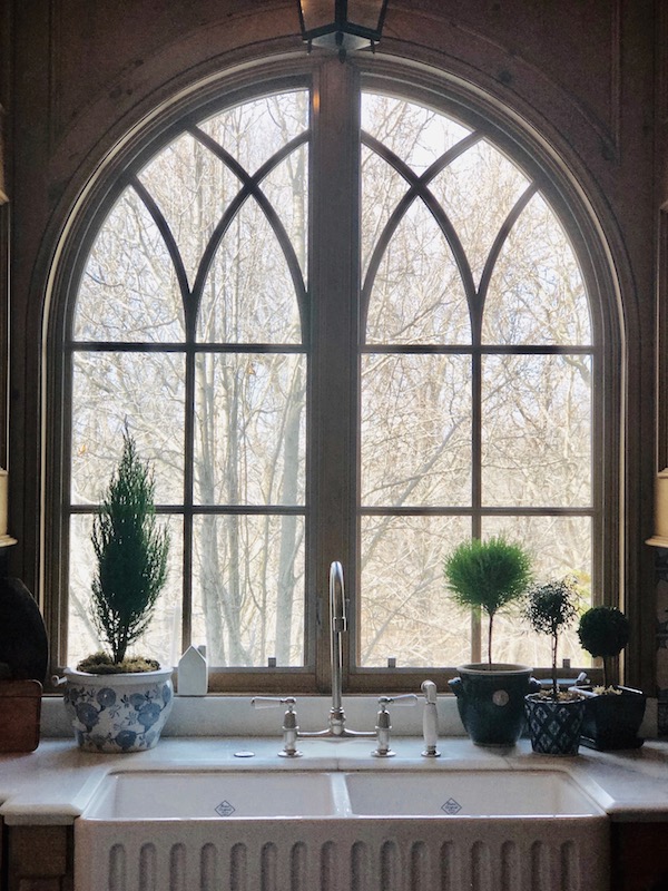
Your timeless home will play upon these details and the interior decor can ebb and flow with the tides playing a bit more with trends. Items like lighting, hardware, even windows, can be swapped out every decade or so, creating a classic, but “au currant” vibe – And of course, the soft and case goods- basically all your decor, can play into the equation nicely.
To me, the most genuine, authentically beautifully spaces, cross time periods, and collections.
Your home should reflect not one specific designer, home decor store or instagrammer of the moment, but you.
Take inspiration from the amazing talent available to you but use it to create your own personal space with your signature style.
A space defined by collecting pieces that resonate with you and your family whether they be family heirlooms, collected items, or recently purchased items- Your home should look like a visual scrapbook of you and your family (albeit a tidy well laid out one) creating a place where comfort and livability is at the top of the list.
Be a collector of stories.
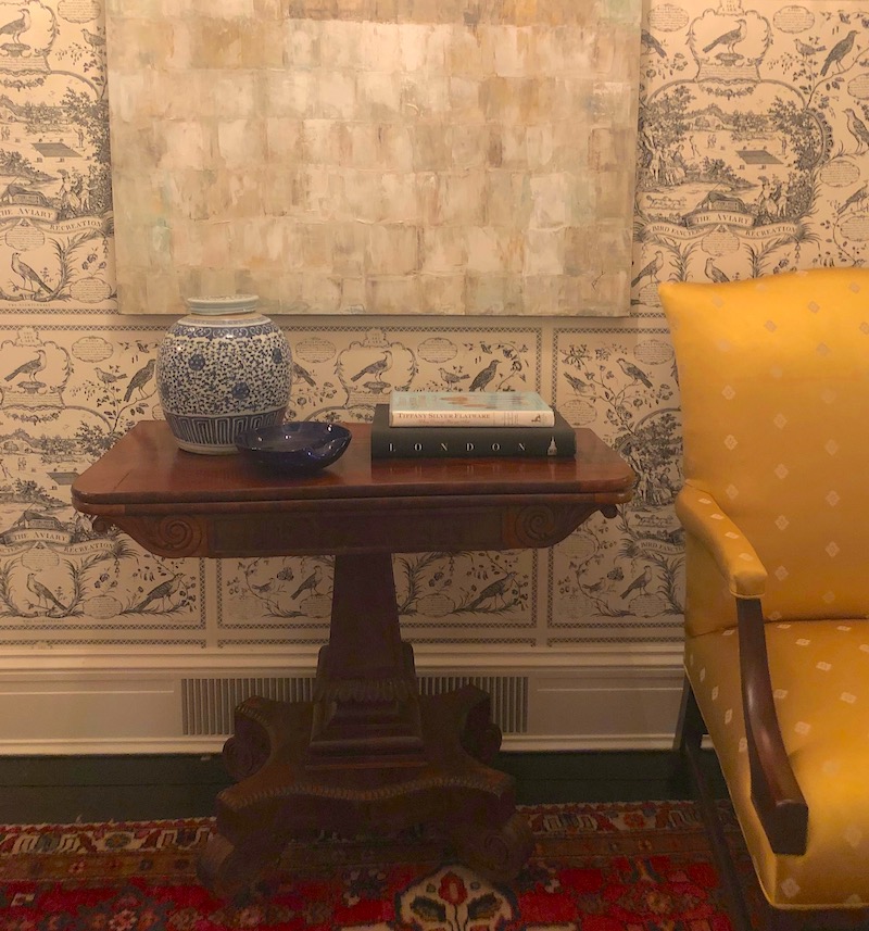
So if and when you are putting your house on the market, you will walk through the rooms and look at dings, scratches and stains, with joy and fondness instead of irritation. A film playing in your head of the who, what and when of your home history.
Getting back to Classic Design.
Timeless design doesn’t pull from trends – it is neither avant-garde, fussy, ornate nor opulent. In fact, timeless décor resists these trends.
Timeless design is quietly understated, simple and sophisticated. This style is one that is designed to be highly functional, yet not bland and boring. Your timeless style is subtle, adaptable and outlasts.
It’s a style that belongs to both its space and its environment.
You can certainly incorporate other elements of design and pull them within, items, for example, from yesterday, today and tomorrow can all be pulled together to create a look that is timeless.
You can place an antique piece of furniture against a neutral wall, under a large piece of modern or contemporary art and it will look fabulous. It’s about creating a sense of balance and order. Function is an important essence of timeless design.


Lets get specific- And let me show you some architectural elements in my Kansas City home that I think resonate really well with classic design.
Looking back to the design phase, I think I had as many pages of design millwork a I did other areas.
Millwork refers to the stuff traditionally made in a mill. Items such as base trim, crown molding, interior doors, door frames, window casing, chair rails and wood paneling are all examples of millwork. These items are all cut and created from raw lumber – in a sawmill – thus, giving them the umbrella term “millwork.”
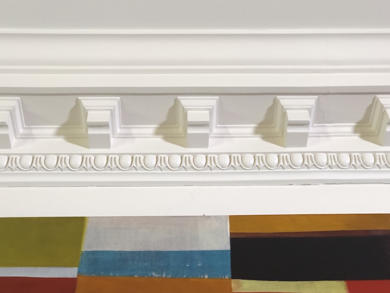
Every molding, every built-in cabinet, door, railing, fireplace surround etc. was hand-crafted in a shop by an amazing team of woods craftsman. It was a crazy long process, but I still admire the workmanship to this day.
During the designing process what were some of the fundamental aspects we considered?
The first – Repetition of a key element.
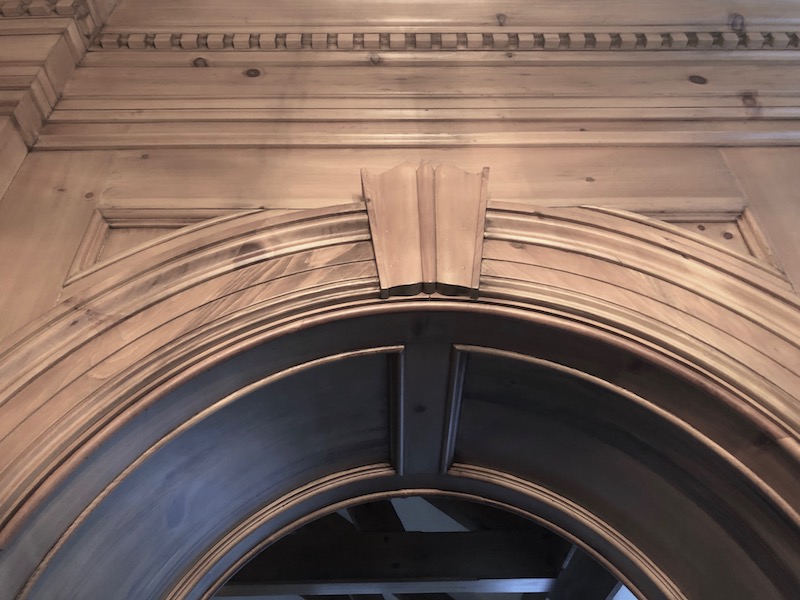
In many areas of the home, I choose to create and incorporate the arch. In doorways, windows, transoms, and ceilings the arch or full circle is representative.
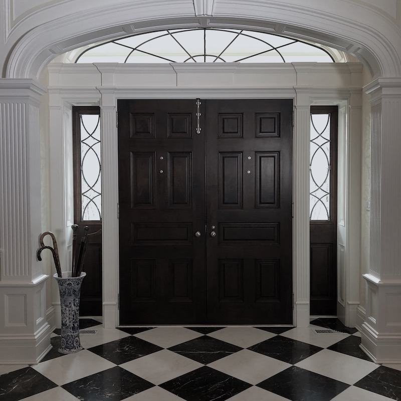

I count four arches 
Repeated in the living room 
Entryway arches throughout the house reinforcing the repetition of the element
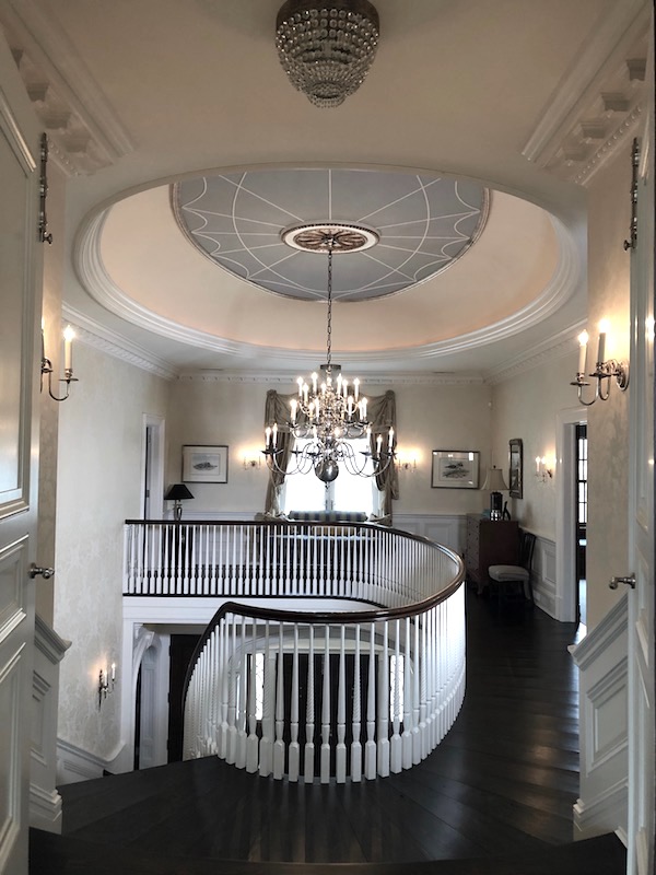
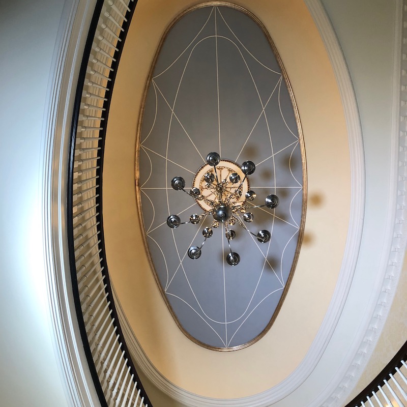

The second – Detail and use of Millwork.
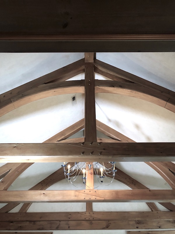
Heavy use of wainscoting and intricate molding designs, such as egg and dart. Fireplace surrounds, beams, built-ins, bannisters and handrails all were beautifully crafted.
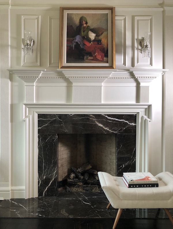

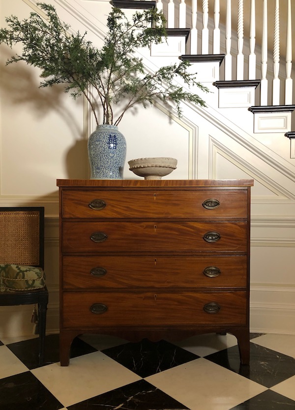
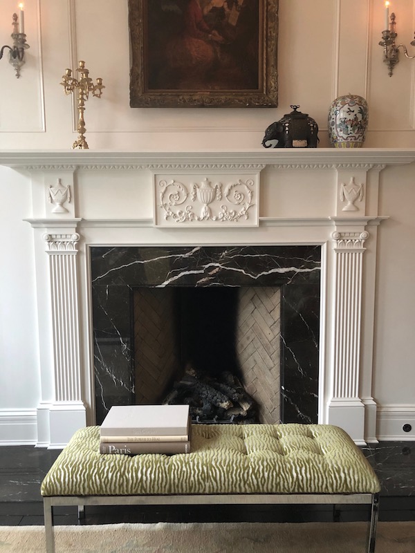

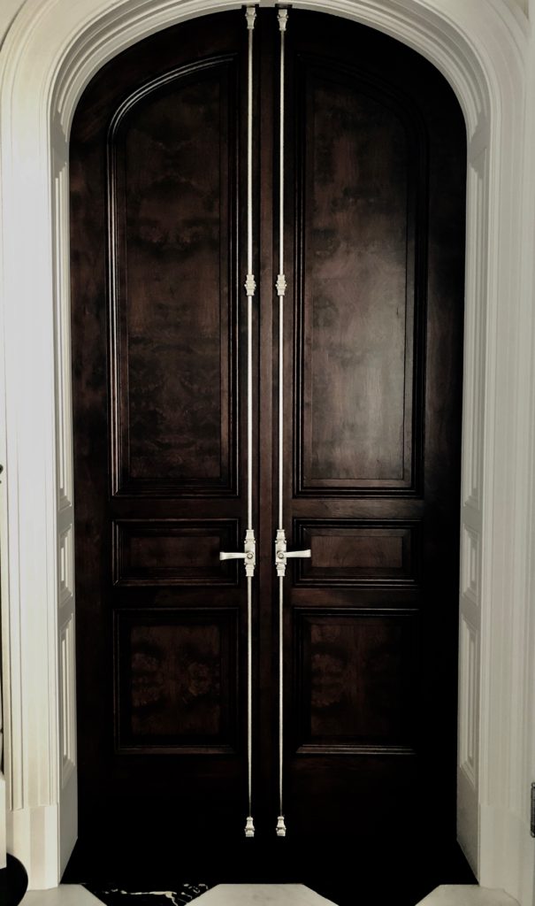
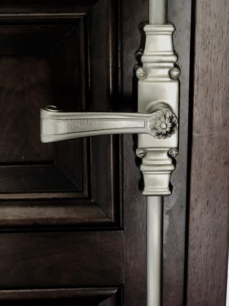
The third is an adherence to using traditional materials.
Restraint was used from materials such as granite, a really hot product fifteen years ago. My surface interiors and exteriors were either; marble, soapstone, stone or wood and honed, not shiny. Never shiny. Unless it’s lacquer paint – but a story for another time
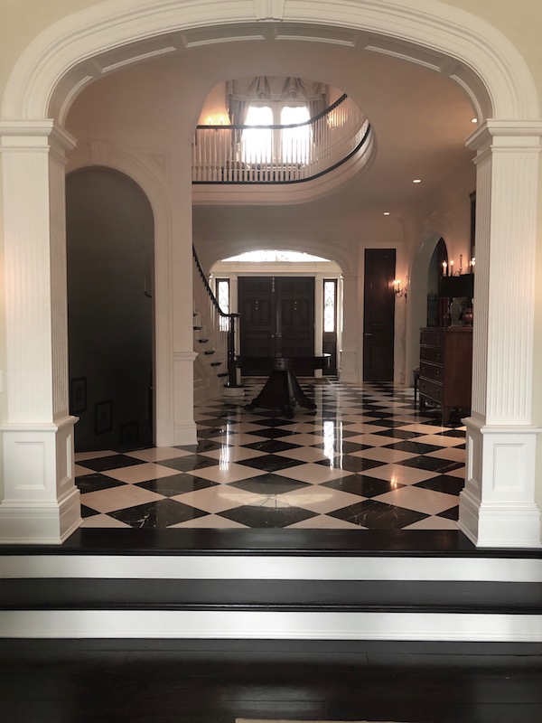


Hand chiseled stone offers a beautiful exterior 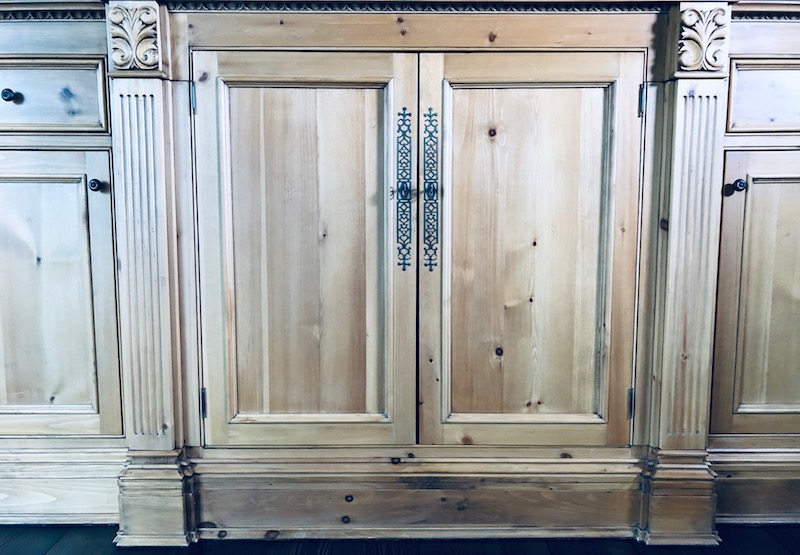
Waxed pine 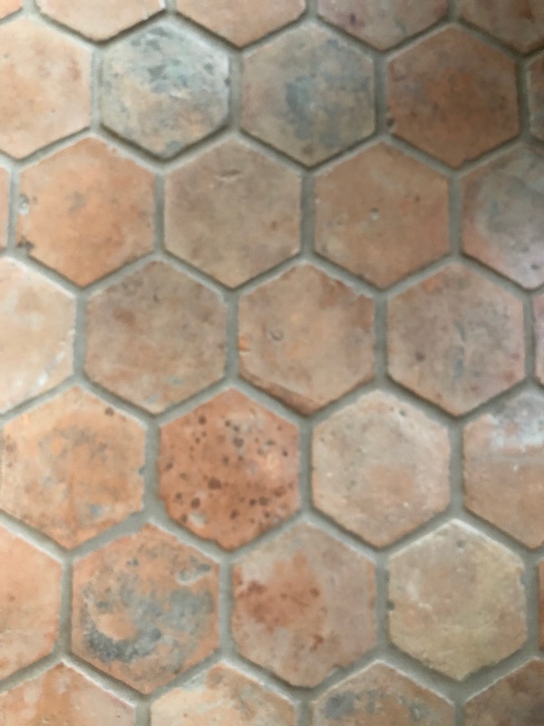
Terra cotta tiles- more matte surfaces
Fourth – Use and treatment of reclaimed materials.
Woods, ceramic tiles and stone were used when sourcing was available and it made sense. Plus it is enviro friendly to use what already exists out there!



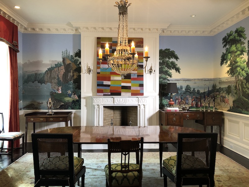
Zuber
If I had to build a home again, I wouldn’t hesitate to create a classically designed home.
Spending thirteen years in fashion, I can compare it to an ageless mannequin. The mannequin is the “bones of your home”. You can put various types, styles and trends on the mannequin, but it doesn’t change the form.
Hope you enjoyed a closer look at classic design and how it reflected in our home – One rich in beauty, comfort, unique design, and above else – love.
Anxious to hear your thoughts on classic design, or comments on this post. And thank you for stopping by Elizabeth by the Sea!
